VLC Website Redesign
A speculative redesign of the VLC Media Player website focused on making a powerful open-source tool feel clearer, warmer, and more approachable for everyday users.

Overview
VLC Media Player is one of the most recognizable free and open-source software tools, known for playing nearly any media file across major platforms. Its existing website communicates that utility clearly, but the presentation feels dated, dense, and oriented toward users already familiar with open-source software culture.
My redesign reframes VLC as a modern, user-friendly product while preserving its practical and trustworthy tone. The project focuses on clearer hierarchy, simplified navigation, warmer visual identity, and a more direct path toward downloading and understanding the player.
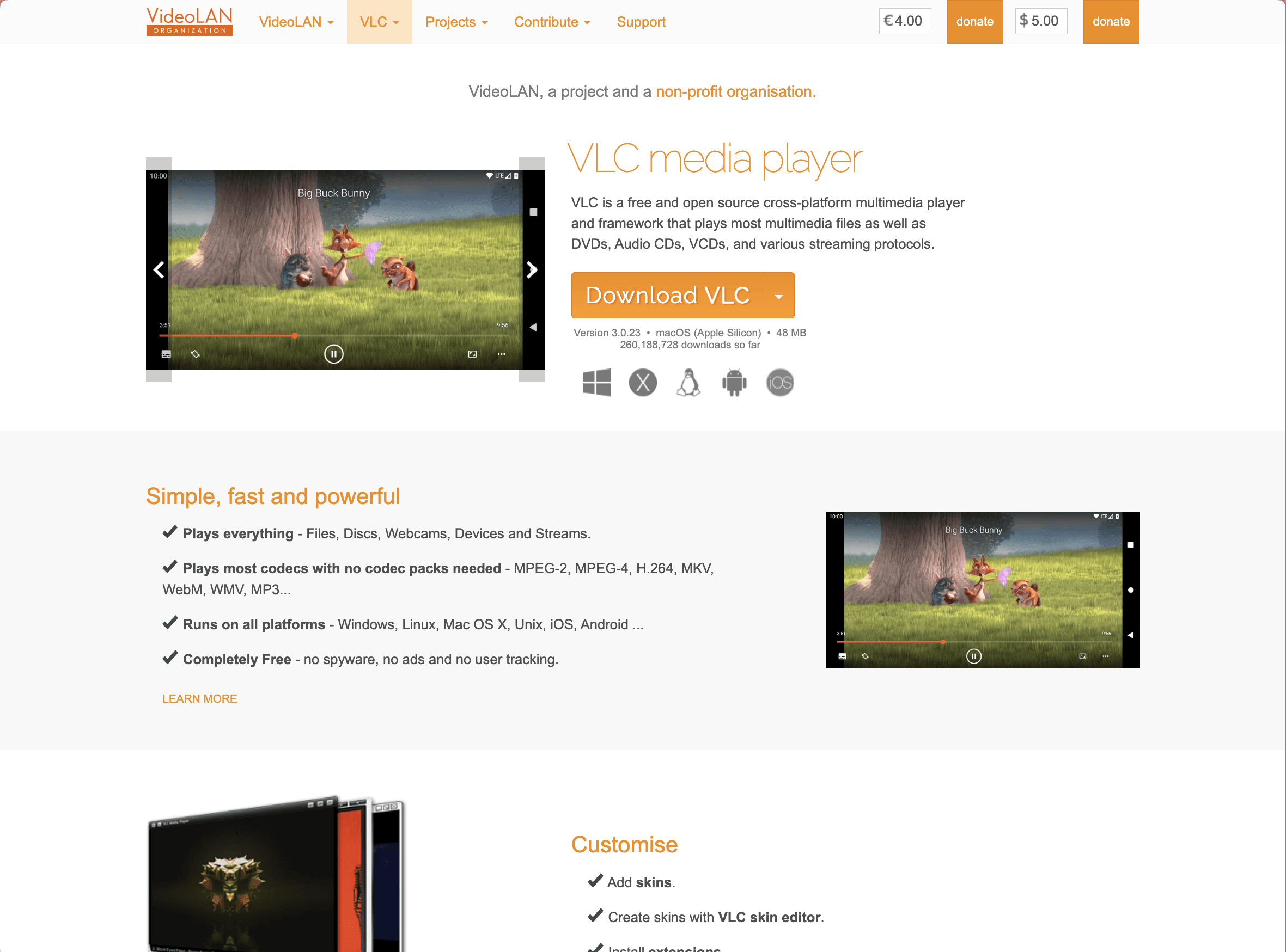
This is a live website, check it out for yourself!
Context
The original VLC site had a strong functional foundation: the download button was easy to find, the software’s core capabilities were visible, and the site clearly emphasized that VLC is free, cross-platform, and reliable. However, the overall experience felt visually dated and text-heavy, with navigation and content structures that could overwhelm less technical users.
The redesign began from the idea that VLC itself should be the center of the experience. Rather than leading with the broader VideoLAN organization or scattered technical resources, the site should first answer a user’s immediate questions: What is VLC? Why should I trust it? What can it play? How do I download it?
Challenge
The main challenge was balancing technical depth with approachability. VLC serves both everyday users and technically experienced open-source users, but the existing site leaned heavily toward the latter. The redesign needed to make the product feel modern and accessible without stripping away its open-source credibility.
The site also needed a clearer content structure. Product features, community resources, documentation, downloads, customization, and organizational information were spread across different areas. My goal was to reduce that fragmentation and create a more intuitive path through the experience.
Starting Point
The starting point was a site that worked functionally but lacked visual confidence. The information was present, but it did not feel organized around a clear user journey. The layout relied heavily on text, older visual conventions, and dense navigation, which made the software feel more niche than it actually is.
I identified three main opportunities: modernize the visual system, reorganize content around user needs, and separate product-facing VLC content from deeper VideoLAN organizational material.

Approach
The strategy was to shift the site from an organization-first structure to a product-first experience. VLC’s value proposition needed to appear immediately, with the download path, feature highlights, and trust cues all visible early in the page.
I reorganized the content into four primary areas: Home, Features, Community, and Download. The content map clarified what belonged in each section, while the flow diagram helped define how a user could move from the homepage into download, features, community resources, or footer navigation.
The redesign also used a warmer visual tone to make VLC feel more inviting. Orange remained central to the identity, but it was supported by soft backgrounds, rounded cards, stronger typography, and large product visuals. The goal was not to make VLC trendy, but to make it feel reliable, clear, and current.

Implementation
The final site was built in Framer with a soft, product-focused visual system. I used large headings, rounded cards, orange accent color, icon-based feature blocks, and product screenshots to create a clearer hierarchy across the site.
The homepage leads with the tagline “Plays it all. Free. Forever.”, followed by a direct download call-to-action and a product preview. The features page breaks VLC’s capabilities into scannable cards for playback, file support, subtitles, containers, and customization. The community page consolidates forums, documentation, contribution, and personalization into one hub. The download page gives the primary operating system download priority while still supporting alternate platforms.
Conclusion
The final redesign creates a more cohesive and approachable experience for VLC. It reduces the friction caused by dense navigation and scattered resources, while preserving the software’s open-source ethos and technical reliability.
By refocusing the site around VLC as a product, the redesign makes the user journey clearer: understand the player, explore its capabilities, connect with the community, and download the correct version. The result is a warmer, more modern interface that better reflects VLC’s value to both everyday users and technically experienced audiences.
This project became one of my clearest studies in interface hierarchy and content strategy. The challenge was not simply making the site look newer, but deciding what information deserved priority and how the experience should guide different types of users.
It also helped clarify my interest in UX and interaction-focused design. The work required thinking through structure, user expectations, navigation paths, visual tone, and implementation. Those decisions made the redesign feel less like a visual facelift and more like a product communication system.